
Many music publications overlook basic accessibility features, creating barriers for fans with low vision, deafness, or reading difficulties. Teams that publish frequently need to build quick checks into their workflow to reduce these obstacles. The pressure to move quickly cannot excuse inaccessible content: it affects perceptions of professionalism and the reach of diverse audiences. Starting with contrast, captions, and readability brings editorial care and inclusive positioning benefits that depend on consistent execution.
Why accessibility matters in music posts
Accessibility in music content is not just an ethical issue: it is part of editorial care that affects how fans experience releases, announcements, and promotional materials. Content with low contrast, missing captions, or complex text excludes audiences who consume music in different ways. In addition, publishing with attention to these details reduces rework and emergency fixes prompted by complaints. Treating accessibility as part of the editorial routine signals professionalism to partners and audiences.
Contrast: essential practices for visual readability
Checking the contrast between text and background is the first step for visual posts. Prioritize combinations that make for quick reading on different screens, including backgrounds with images or gradients. Use contrast-checking tools to assess the relationship between colors, and adjust font sizes or weights when needed. Remember that contrast affects both text and navigation elements and visual calls to action within the creative.
Captions and transcripts: reach and comprehension
Adding captions to videos serves both deaf viewers and people who consume content without sound while commuting or in public places. Choose accurate captions, synchronized with the audio and divided into logical phrases. For long audio, provide transcripts to make the content easier to search and index. Explain technical terms, names, and instrumental passages when relevant to improve clarity.
Readability and text structure: adapt language and hierarchy
Post copy should prioritize clarity, vocabulary suited to the audience, and a structure that makes visual scanning easier. Use short sentences, brief paragraphs, and hierarchy cues: titles, subtitles, and highlights: to guide readers. Avoid unexplained jargon and maintain a consistent style across platforms. Adjust information density to the format: a carousel can support more detail; a single image calls for a direct message.
How to hire or carry out professional accessibility services
When hiring or delegating the work, define the scope: a one-off review for a release, a checklist applied to a weekly routine, or the complete production of accessible assets. Look for providers with digital-content experience and a portfolio showing care with contrast, captions, and text structure. Ask about the review process, tools used for technical checks, and delivery timelines; require samples or tests before signing a contract. Remember that pricing and rights vary by scope, and specific legal questions may require specialized advice.
Why rely on Deal's Art for this editorial care
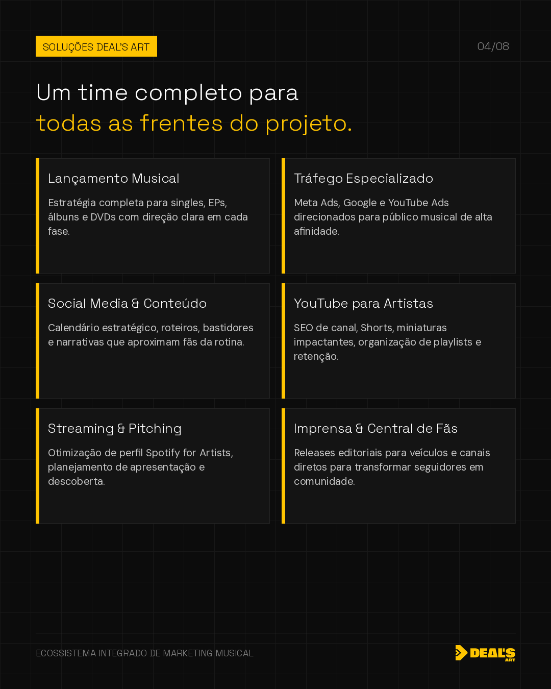
Deal's Art offers social media and content services focused on artists and their teams, with workflows that incorporate checks for contrast, captions, and readability. Our work aims to align aesthetics, brand consistency, and accessibility practices with the client's publishing workflow. We can assess existing materials, suggest adjustments, and create processes to reduce editorial rework. For cases requiring contractual decisions or legal and technical determinations, we recommend consulting the appropriate specialists.
A consistent strategy connects creation, context, and relationships. If you'd like to organize your next cycle with an integrated perspective, Deal's Art can help define the project's priorities.
Present my project