
Artists and teams producing digital content often face the dilemma of maintaining brand aesthetics while ensuring good readability for diverse audiences. Contrast issues and unsuitable typographic choices can harm communication, reach, and user experience. With increased consumption on small screens and a stronger focus on accessibility, visual adaptation has gone from optional to a quality requirement. Adopting clear criteria reduces uncertainty during execution and helps preserve identity without sacrificing legibility.
Why contrast matters for digital assets
Adequate contrast between text and background is essential for quick reading and for people with low vision or reading-related conditions. Beyond accessibility, insufficient contrast compromises message comprehension on screens with variable brightness or in outdoor environments. Checking tools help assess whether a color combination meets recognized standards, but final decisions should also consider the aesthetics of the visual identity. Subtle contrast adjustments can maintain the brand palette while preserving legibility.
Typography: choosing typefaces and weights
Font selection directly affects reading and brand perception; decorative fonts or tight spacing can make text harder to decipher at small sizes. Prioritize typeface families that are easy to read on screens, with different weights and styles and support for special characters used in the language. Consider typographic hierarchy for titles, subtitles, and body text, ensuring consistency across formats. Testing on actual devices helps identify where to adjust size, line height, and letter spacing.
Readability beyond color: spacing, size, and composition
Readability involves more than color alone; factors such as relative text size, line height, line length, and contrast with graphic elements affect reading. In social media assets and banners, for example, combining a background image with text requires overlays, shadows, or color blocks to maintain clarity without obscuring the image. For small screens, prioritize short messages and larger font sizes, while desktop assets can accommodate longer bodies of text with spacing adjustments. These decisions should be tested in real publishing contexts to ensure they work.
Tools and objective criteria for evaluation
Tools are available to calculate contrast ratios and simulate color blindness, providing practical metrics to guide color choices. Criteria such as contrast ratios recommended by international standards provide technical parameters to follow, but interpreting these figures requires design and project knowledge. Use typography and accessibility checklists to review assets before publication, and integrate user testing whenever possible. Recording versions and changes helps justify visual identity decisions to stakeholders.
How to hire for or carry out a visual accessibility project
Define the scope: an inventory of existing assets, priorities by format (post, cover, website, press kit), and target audiences with specific needs. Look for professionals or teams with a portfolio in screen design, experience with accessibility standards, and testing processes; request work samples and methodology, as well as clearly defined deliverables. Establish review criteria that include contrast tests, typographic guidelines, and mockups on actual devices. Consider a project-based contract with stages for diagnosis, prototyping, review, and delivery of guidelines for ongoing use.
Connecting this need to Deal's Art
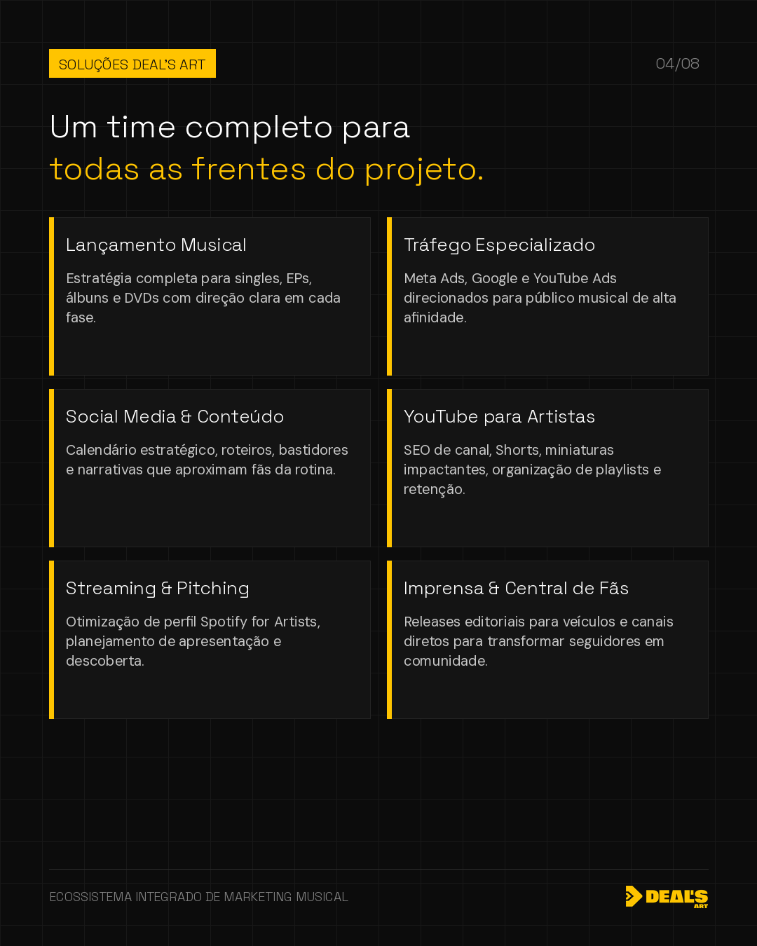
Deal's Art offers design and visual identity services for artists and their teams, focusing on readability, contrast, and application across digital formats. Our work seeks to align technical accessibility criteria with each artist's visual personality, preserving identifying elements throughout the process. For complex projects or those involving contracts, rights, and strategic decisions, we can detail the scope and timeline according to the client's needs. If you prefer, we can begin with an assessment to identify priorities and execution options.
A consistent strategy connects creativity, context, and relationships. If you'd like to organize your next cycle with an integrated perspective, Deal's Art can help define the project's priorities.
Present my project